
A Grid block divides the page into a set of cells. Each cell holds its own content. On large screens, cells sit side by side. On small screens, they stack into a single column, so the layout stays readable on any device.
Grid works well for:
feature or product comparisons
learning objectives or outcomes
icon-and-text pairs
a set of related images or media
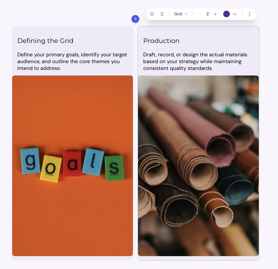
You can add a Grid block anywhere in a lesson.
1. Open the lesson in the lesson editor.
2. Place the cursor on an empty line where you want the Grid.
3. Click add in the card toolbar to open the insert menu, then select Grid.
The editor adds a Grid with 2 cells. Each cell starts with a placeholder heading and description.
Each cell accepts any kind of block content. You can add:
headings and paragraphs
images, videos, and other media
code blocks
nested layout blocks
To edit a cell, select inside it and type or paste your content.
A Grid supports 2 to 8 cells.
1. Select the Grid block.
2. In the toolbar, find the cell counter.
3. Select + to add a cell, or − to remove the last cell.

The toolbar above a selected Grid offers more controls.
Layout type: switch between Grid, Steps, Timeline, Alternating, and Cycle
Color: set a color for the whole Grid block
Constrain width: limit the Grid to 800 pixels wide, or switch to Full width to fill the page
Icon: add an icon to an individual cell. Select the cell, then pick an icon from the cell toolbar.
The Grid is responsive by design.
on narrow screens, cells stack into a single column
on wider screens, cells sit side by side, with at least 200 pixels per cell
the number of columns adjusts to fit the space, so the layout stays balanced
You do not need to configure breakpoints or column counts.
Layout block width
The Constrain width option controls how wide a layout block spans on the lesson page. You can set the width for each block, so different layouts in the same lesson can use different widths.
