
The color picker in the editor groups options into four sections, in this order:
Theme: colors defined in your brand theme. Apply these to keep your course on-brand.
Recent: colors already in use elsewhere in the current lesson. Pick from this section to reuse a non-theme color without scrolling the full palette or copying a hex code.
Pick a color: enter a custom hex color, or pick a value from the color wheel.
Standard: the built-in color palette.
Recent colors are deduped against Theme, so a color that already exists in your theme does not appear under Recent.
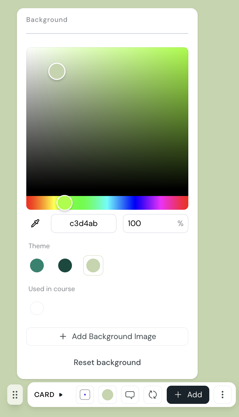
CreateUpon scans the lesson plan and surfaces every color that is currently in use. When you pick a color that is not in your theme, that color appears under Recent in every other color picker in the same lesson.
the scope is the lesson plan, so colors used in any module, lesson, or card in the same course feed the Recent section
colors appear in Recent automatically once they are applied somewhere in the lesson
Recent supports hex color codes only
if you remove the last usage of a color, it stops appearing in Recent
You can change the color of text, card backgrounds, layout sections, quiz components, callouts, buttons, and charts. The picker opens from the relevant toolbar or floating menu.
1. Select the element you want to change.
2. Open the color picker from the toolbar or floating menu next to the element.
3. Pick a value from Theme, Recent, or Standard, or open Custom and enter a hex code (for example, #1A73E8), pick a value from the color wheel, or use the eyedropper to sample a color from anywhere on your screen.
4. Close the picker to apply the change.
For card, layout section, and callout backgrounds, the picker also includes an opacity slider so you can make the background more or less transparent.
The color picker shows up wherever an element can be tinted, including:
text color and highlight in the text formatting toolbar
card background, from the card floating menu
section and column background, from layout block menus
button color
callout color
quiz appearance, on multiple-choice, matching, ranking, sorting, true-or-false, and open-answer quizzes
chart data series colors
apply theme colors where you can, so your course stays on-brand and updates automatically when your theme changes
use Recent to reuse one-off colors across a lesson without storing them in the theme
save colors you want to reuse across courses to your brand theme rather than relying on Recent, because Recent is scoped to a single lesson
Fonts: search and choose a font
Choose a font from a large library anywhere you set one, and use the searchable picker to find the exact one you want.
Custom Themes
Create reusable brand themes that define your course colors, fonts, logo, and corner styles.
Setup: create your brand theme before your first course
Extract a starting theme from your company website, pick a preset, or build a theme from scratch before you create your first course.
