
Cycle shows a colored ring split into numbered segments. Each segment links to a content block that describes the item. CreateUpon numbers the segments for you, starting at 1.
On large screens, the ring sits in the center, with items on the left and right. On narrow screens, the ring sits at the top, and the items stack in a single column below.
Cycle works well for:
• software release or product development cycles
• recurring workflows that return to their starting point
• natural cycles, such as a water cycle or feedback loop
• any process where continuity and repetition matter more than a fixed start and end
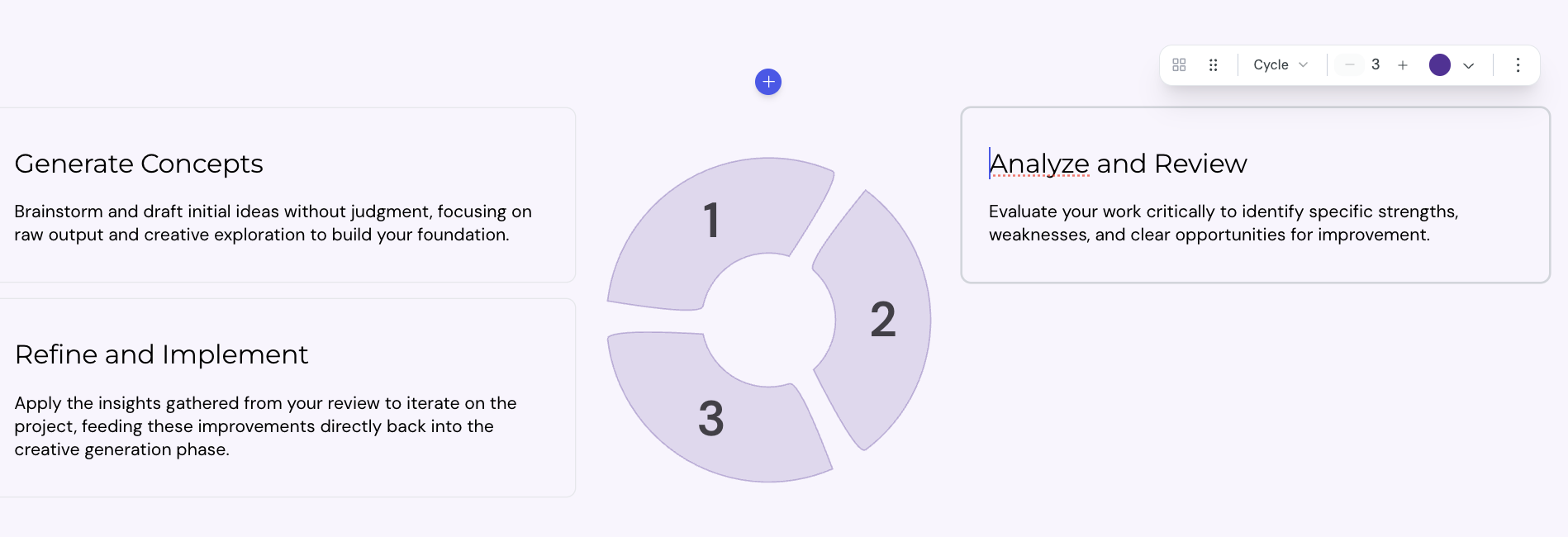
You can add a Cycle block anywhere in a lesson card.
1. Open the lesson in the lesson editor.
2. Place the cursor on an empty line inside a card.
3. Type / to open the insert menu, then select Cycle.
The editor adds a Cycle with 3 segments. Each segment starts with a placeholder heading and description.
Each segment accepts any kind of block content. You can add:
• headings and paragraphs
• images, videos, and other media
• code blocks
• nested layout blocks
To edit a segment, select inside the content area and type or paste your content.
A Cycle supports 3 to 8 segments.
1. Select the Cycle block.
2. In the toolbar, find the cell counter.
3. Select + to add a segment, or − to remove the last segment.
CreateUpon renumbers the segments and redraws the ring to fit the new count.

The toolbar above a selected Cycle offers more controls.
• Layout type: switch between Grid, Steps, Timeline, Alternating, and Cycle
• Color: set a color for all ring segments in the block
• Constrain width: limit the block to 800 pixels wide, or switch to Full width to fill the page
You can also override the color of an individual segment. Select the segment, then pick a color from the cell toolbar.
You can also add an icon to an individual segment. Select the segment, then pick an icon from the cell toolbar.
Layout & columns
Configure the column layout of your card
Layout block width
The Constrain width option controls how wide a layout block spans on the lesson page. You can set the width for each block, so different layouts in the same lesson can use different widths.
